
By John Port, M.D., Ph.D., 2019 Annual Meeting Program Committee Chair
 ?
?As many of you have already heard, the ISMRM is making the epic leap to all digital posters for the 2019 Annual Meeting in Montréal. So as your abstracts have been accepted, and you are starting to put together the content of your posters, the question abruptly arises: How do you assemble a digital poster?
If you’re like me, you dust off the Powerpoint or Keynote file of your poster from last year and modify it to make your new poster. Those posters were 36 inches wide by 36 inches tall, setup to print on paper, and used font sizes in points (where 1 point = 1/72 of an inch). So titles were typically 72 points (1 inch), headings were typically 54 points (3/4 inch), the main text was typically 36 points (1/2 inch), and the fine print (used for references, etc) was typically 24 points (1/3 inch).
Yikes! How do you convert that to display well on a 43-inch 16:9 high-definition 1080p digital monitor? First, a little background. A 43-inch diagonal monitor is approximately 37 inches wide by 21 inches tall. So width is no problem, it’s a little wider than a paper poster. BUT it’s definitely shorter, so the problem arises – how do we squeeze 36 vertical inches of content into 21 inches of height? And what font sizes should I use for the digital environment? 1920 by 1080 pixels divided by 37 by 21 inches? Arrgh!!!
Ok here’s the scoop. First, set the presentation for on-screen display. In Powerpoint, go to File->Page Setup…, click on Slide sized for: and select On-screen Show (16:9). Do NOT change the width or height, just click ok. You will probably get an error message stating “You are converting to a smaller slide size. Do you want to scale content down?” Just select the Scale button. In Keynote, click the Document button in the top right of the window. Make sure the Document tab is selected, then look for Slide Size and select Widescreen (16:9) from the drop-down menu. Your poster will now fit properly onto a 43″ monitor. BUT: the text got really small, too small to read at any reasonable viewing distance (i.e. 15-24 inches from the monitor. And there’s a lot of wasted space on the outside edges. What to do?
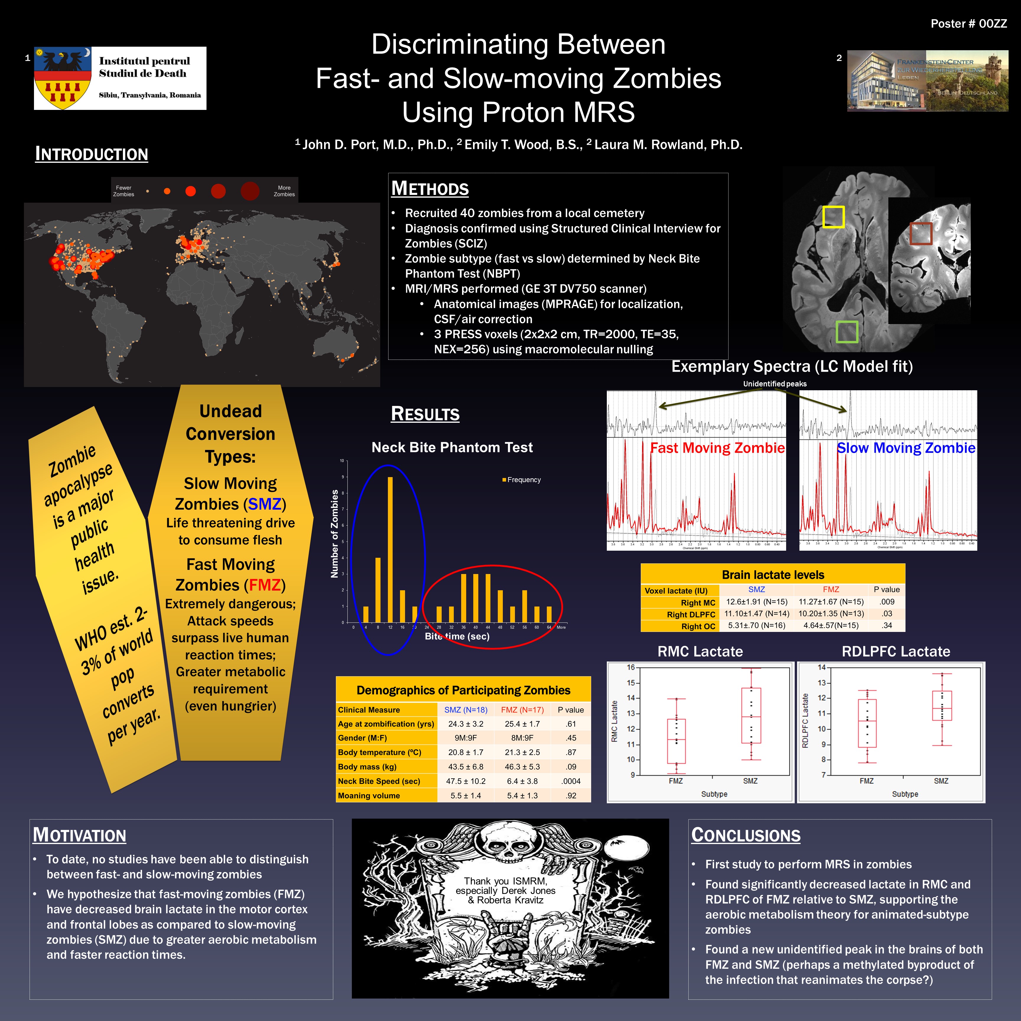
Some examples. I dusted off an old Power Pitch poster that I presented at the 2014 Annual meeting in Milan (ZPoster_original.pptx). I resized it as described above, and got a fairly lousy looking poster (ZPoster_resized.pptx). I moved elements around and made a passable 1-slide “traditional poster” version, preserving as much content as possible. It wasn’t too bad, but I definitely needed to cut down the content (ZPoster_Traditional.pptx).
To preserve all the content, I modified it by splitting the presentation into two slides (ZPoster_2slide.pptx). I put the Title, Introduction, and Methods on the first slide, and the Results, Discussion and References on the second slide. For font sizes, I use the “Divide by 3” principle – divide the paper-poster font size by 3. So use:
Title: 24 points
Headings: 18 points
Text: 12 points
Fine print: 8 points
As for choice of font type, I am a big fan of using boring fonts. Calibri, Times, and Arial (or their equivalents) are available on most computer systems, and thus you will need very little (if any) modification of the poster once you’ve uploaded it if you stick to these common fonts. Plus Calibri has fixed-width numbers, so tables with numbers and decimal points are easy to line up. You can use fancy fonts if you want, but there are no guarantees that things will look good following upload. (Editor’s note: Don’t forget to EMBED FONTS!)
The cool thing about digital posters is that you can do anything for your poster that you can do in a slide show. For example, you can add in animations (ZPoster_2slide_animated.pptx), movies, whatever you want. Also – as we recommend up to 10 slides maximum per digital poster – you can setup your poster like our old-style electronic poster (ZPoster_Eposter.pptx).
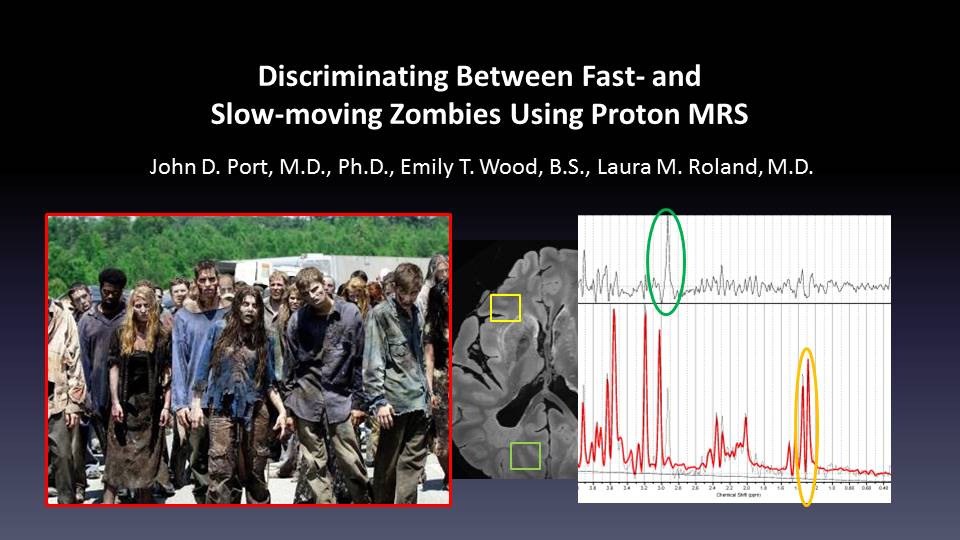
Example teaser slide
Also new this year as part of D-posters, we’re requiring everyone to submit a single “teaser” slide in .jpg format. It will be used like a screen saver on the monitors in between poster sessions. The Teaser slide (example: ZPoster_Teaser.pptx) should only include the title of the talk, the authors, and a few small pictures selected to grab someone’s interest and make them want to know more about your work. After creating your single slide, please export it as a .jpg file. Jpg is the only acceptable format for the screen slide.
One final point – you can only upload D-Posters in PowerPoint format. So if you use Keynote, as a last step, go to File -> Export To -> PowerPoint… and follow the steps to save the file.
As we’ve never done anything like this before, it’s impossible to predict how people will make their posters this year. The most important thing is to present your science well, but secondarily, be creative and have fun!
I’ve literally never made a poster in Powerpoint — it’s not page layout software. My group’s poster templates are all (Xe)LaTeX. I’m not necessarily a huge fan of this change. Can I use TeX/open source software instead?
Why not? Steps: – Make your poster in LaTeX in 16:9 aspect ratio, export as a PDF. – Open any presentation software (LibreOffice Impress, Google Slides, PPT, Keynote) place the PDF in a single slide (just as you would an image, or PDF in a Talk) – Export as PPT file! You don’t even need Powerpoint to test it… I think this is a very positive change – unfortunate it’s restricted to PPT files, but progress must be made at some cost. The annoyance of having to lug around printed posters, deal with poster tubes on the plane, iron out… Read more »
You could use: Office Live, Google Slides, OpenOffice or LibreOffice. They are more or less equally poor choices as Office, but they will export to a compatible file format. As for the slideshow vs page layout software, you could think of d-poster as a large-screen version of last year’s e-posters (as explicitly stated in the official guideline) — so, basically, slideshows.
Same here, we only use LaTeX templates and I honestly think LaTeX is way better suited to layout a poster than Powerpoint (if you plan to have a single-slide poster). As I work on a Linux system, I’m also really not a fan of this change because I needed to get access to a windows system with Powerpoint just for this poster. It would generally be great, if the use of open source software would be supported for presentations etc.
I’m really not sure I like this change — I’d much rather I didn’t have to use powerpoint for this as it’s not a page layout programme, and other alternatives (e.g. LaTeX) are both free, Free, and in my opinion better suited to putting text on (virtual) page in a way that looks pretty.
The weird thing is that PDF is not accepted, because, allegedly the software to make it web-friendly does not support PDF. Except that PDF is already web-friendly, or am I missing something?
Thank you!!
I want to know how to upload the Digital Poster
Very useful. Thank you!
Is the resolution of the teaser really 600×338 px? Seems a bit small for HD resolution.